So this is the start of my book sequence. I had to get the pictures done and just needed something to take pictures of....I guess there was a pile of books that I just started to add on to. It did make an awesome sequence, that if turned into a stop-motion video looks really, really good. Maybe I will do that.

1

2

3

4

5

6

7

#41. What a great number, huh. This is an aspen tree. I carved the number with my thumb nail....(yes I have rather long, male finger nails). I think I could have gotten closer to the tree, I do like the exposure and focus. I wonder why I chose 41....

This is comical. That is why I took the picture. Its a picture of swim suit bottom.....I don't know I thought it was funny. Its a bit black I think, but it has pretty solid focus. I didn't think of this at the time but its ironic that the suit costs 37$. That just seems so much for a piece of clothing.

This one was fun to shoot. It was taken at school (Ya fail me) but I had this idea to use people. So I got my friends together and said "Make me a 23." They kinda did it themselves....and I took it while they weren't ready. I took the picture and then said on 3...1...2...3... and didn't actually take the picture. This one is actually interesting just to see what the people were doing in the natural sense. They would have definitely have acted differently if I would have taken it when they thought I had. This is a portrait in my opinion. Look at Josh's arm, look at his stance, it just YELLS josh. Jamie's face is so -_- (Jamie face). Its such a portrait.

>
Printed: This is probably my favorite number picture. Before this class, I kinda had a portfolio of me taking pictures of my feet with these big black boots, all over. It was just kinda neat. That's what I tried to imitate in this photo. I started with the number 4 made of bark, but then I wanted to make my feet in the picture and I think the number automatically turned into 24, without me putting effort in. At first I editted this too contrasty and extreme, then Mr. Slade told me to turn it down. So did Julianne and Josh....I liked it contrasty...I hardly moved it down. I wanted to keep my pants black, but wanted the light parts pretty light. I guess I'm developing my own taste.

This one was my brother, Elliott,'s idea. I give him credit. It was very clever. I guess my problem was with this picture was the poor lighting. I had such a long shutter and didn't want to make it blurry. I do like the lighting however--it looks really good though....the number is just a little hard to see maybe.

Printed: Mr. Slade said in class "Who took a picture of a scar that looked like a 7?" He said it jokingly. But I really did have an image of a scar of a seven on my wrist. And no, I am not a cutter--I was born with this (Ask my dear mother, God bless her heart.) At first the seven didn't really pop out...you could hardly see. So I added that gradient contrast to make it work a better. It makes the 7 pop more. Its not a super interesting picture.

1

2

3

4

5

6

7

#41. What a great number, huh. This is an aspen tree. I carved the number with my thumb nail....(yes I have rather long, male finger nails). I think I could have gotten closer to the tree, I do like the exposure and focus. I wonder why I chose 41....

This is comical. That is why I took the picture. Its a picture of swim suit bottom.....I don't know I thought it was funny. Its a bit black I think, but it has pretty solid focus. I didn't think of this at the time but its ironic that the suit costs 37$. That just seems so much for a piece of clothing.

This one was fun to shoot. It was taken at school (Ya fail me) but I had this idea to use people. So I got my friends together and said "Make me a 23." They kinda did it themselves....and I took it while they weren't ready. I took the picture and then said on 3...1...2...3... and didn't actually take the picture. This one is actually interesting just to see what the people were doing in the natural sense. They would have definitely have acted differently if I would have taken it when they thought I had. This is a portrait in my opinion. Look at Josh's arm, look at his stance, it just YELLS josh. Jamie's face is so -_- (Jamie face). Its such a portrait.

>
Printed: This is probably my favorite number picture. Before this class, I kinda had a portfolio of me taking pictures of my feet with these big black boots, all over. It was just kinda neat. That's what I tried to imitate in this photo. I started with the number 4 made of bark, but then I wanted to make my feet in the picture and I think the number automatically turned into 24, without me putting effort in. At first I editted this too contrasty and extreme, then Mr. Slade told me to turn it down. So did Julianne and Josh....I liked it contrasty...I hardly moved it down. I wanted to keep my pants black, but wanted the light parts pretty light. I guess I'm developing my own taste.

This one was my brother, Elliott,'s idea. I give him credit. It was very clever. I guess my problem was with this picture was the poor lighting. I had such a long shutter and didn't want to make it blurry. I do like the lighting however--it looks really good though....the number is just a little hard to see maybe.
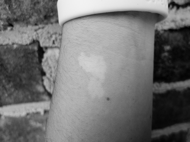
Printed: Mr. Slade said in class "Who took a picture of a scar that looked like a 7?" He said it jokingly. But I really did have an image of a scar of a seven on my wrist. And no, I am not a cutter--I was born with this (Ask my dear mother, God bless her heart.) At first the seven didn't really pop out...you could hardly see. So I added that gradient contrast to make it work a better. It makes the 7 pop more. Its not a super interesting picture.
One thing I was upset with during this project is how long it took. But I did fix it via my book solution. I also didn't like the stories I made. The numbers project didn't allow me to write and create a story as much as I normally like to. The blurry books kinda does get the idea of Waterford illustrated. So many books they just kinda blend together and make confusion and make me head hurt. I guess the lesson I learned from this assignment is to get things done and get some images. Also, life's too short to be a perfectionist....well maybe its not.


